Inaru
Services —
Branding
Art Direction
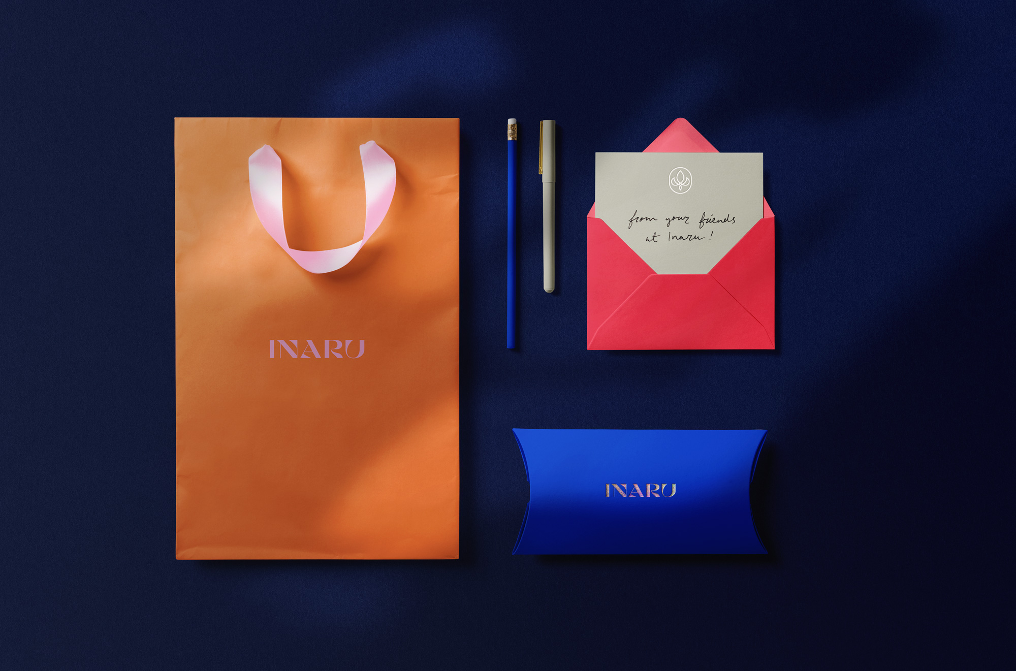
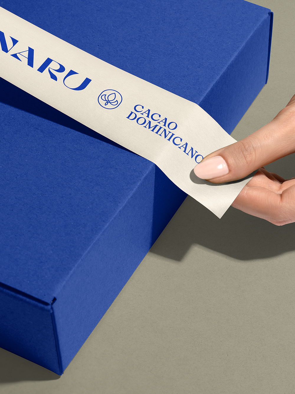
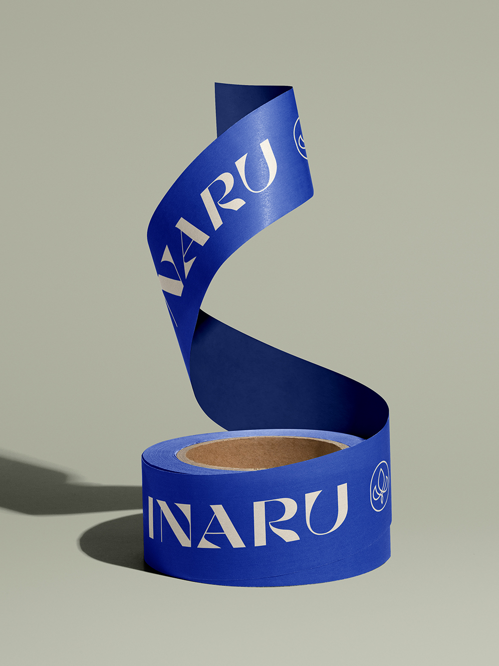
Packaging
Illustration
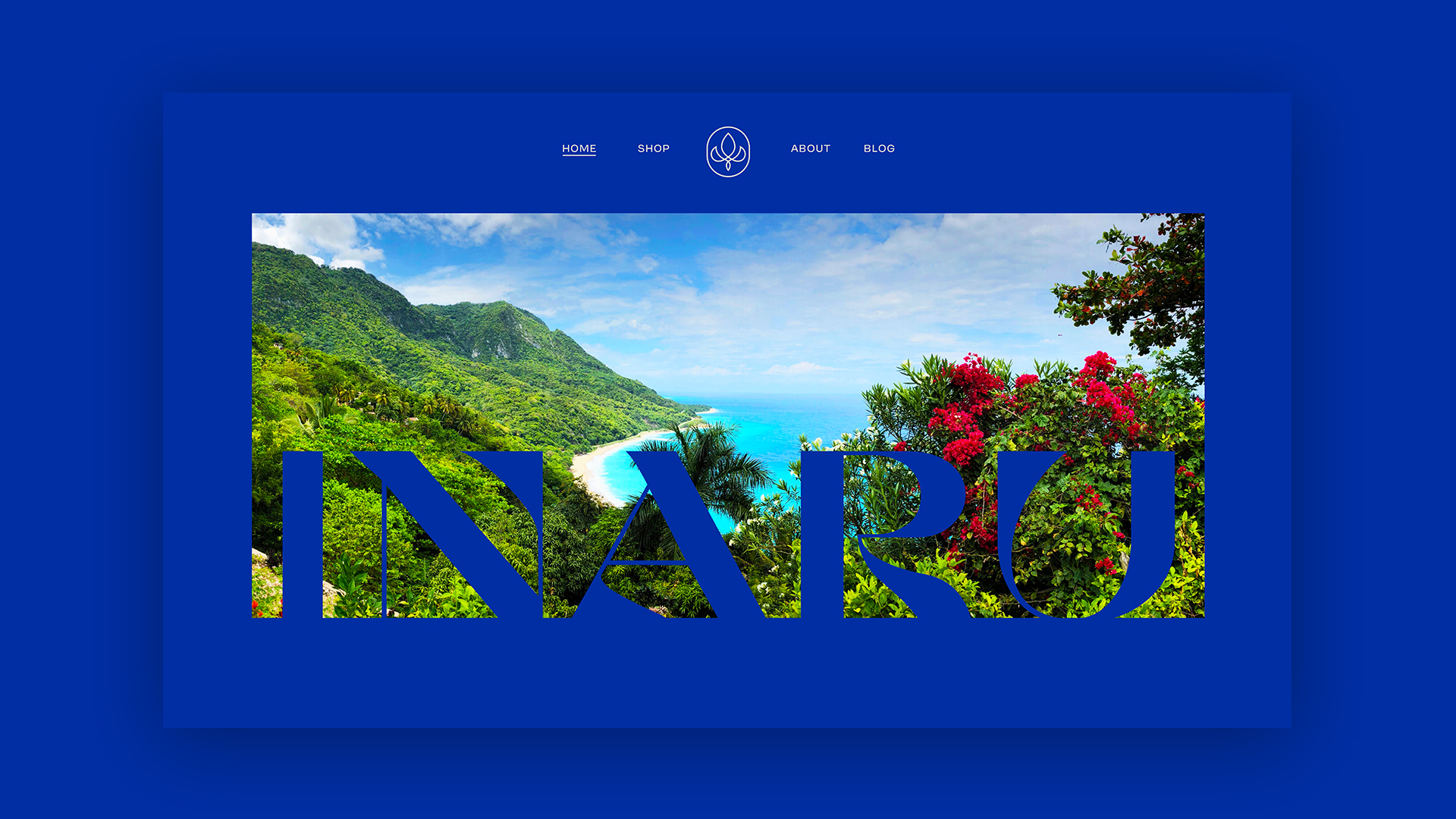
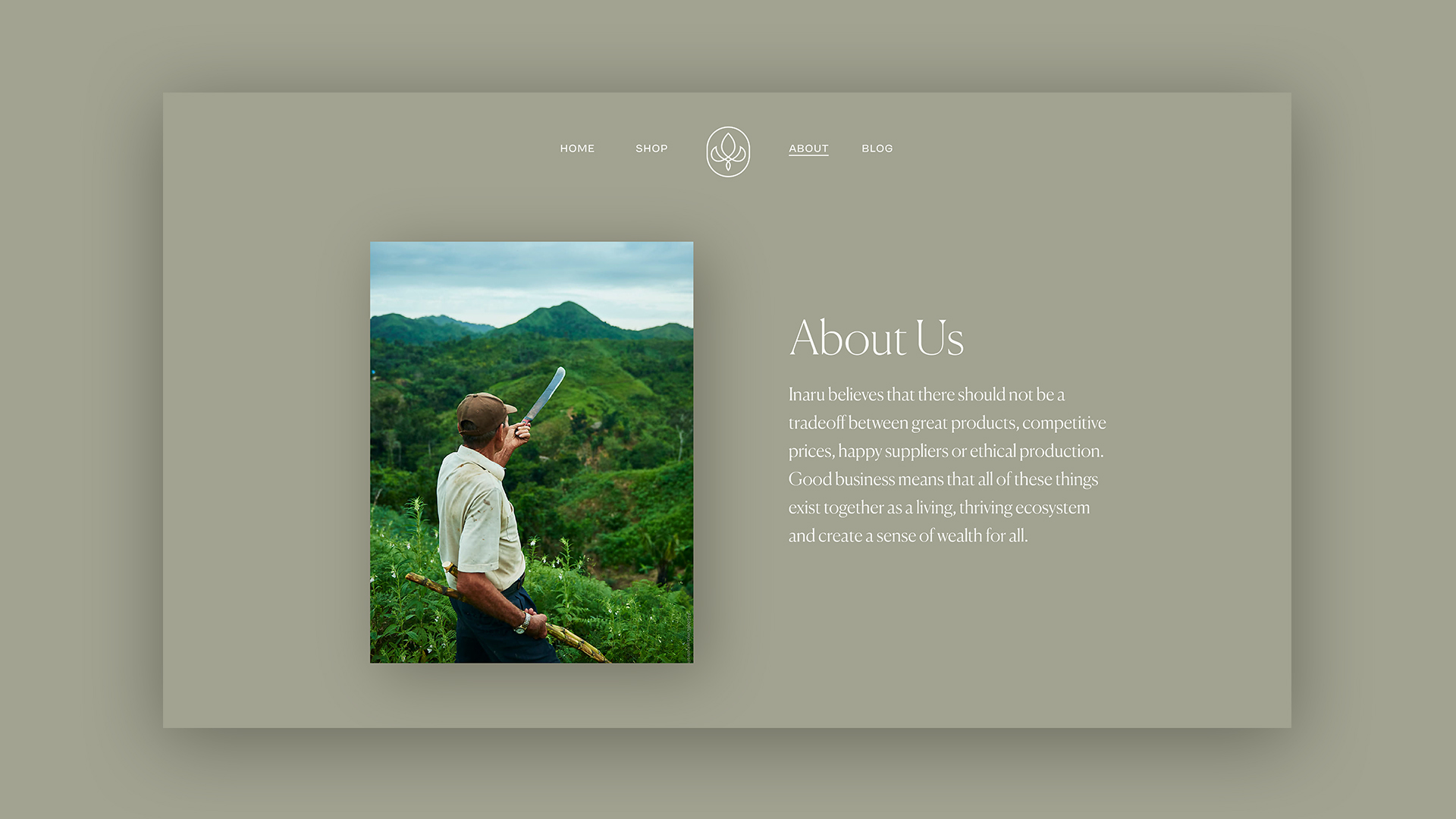
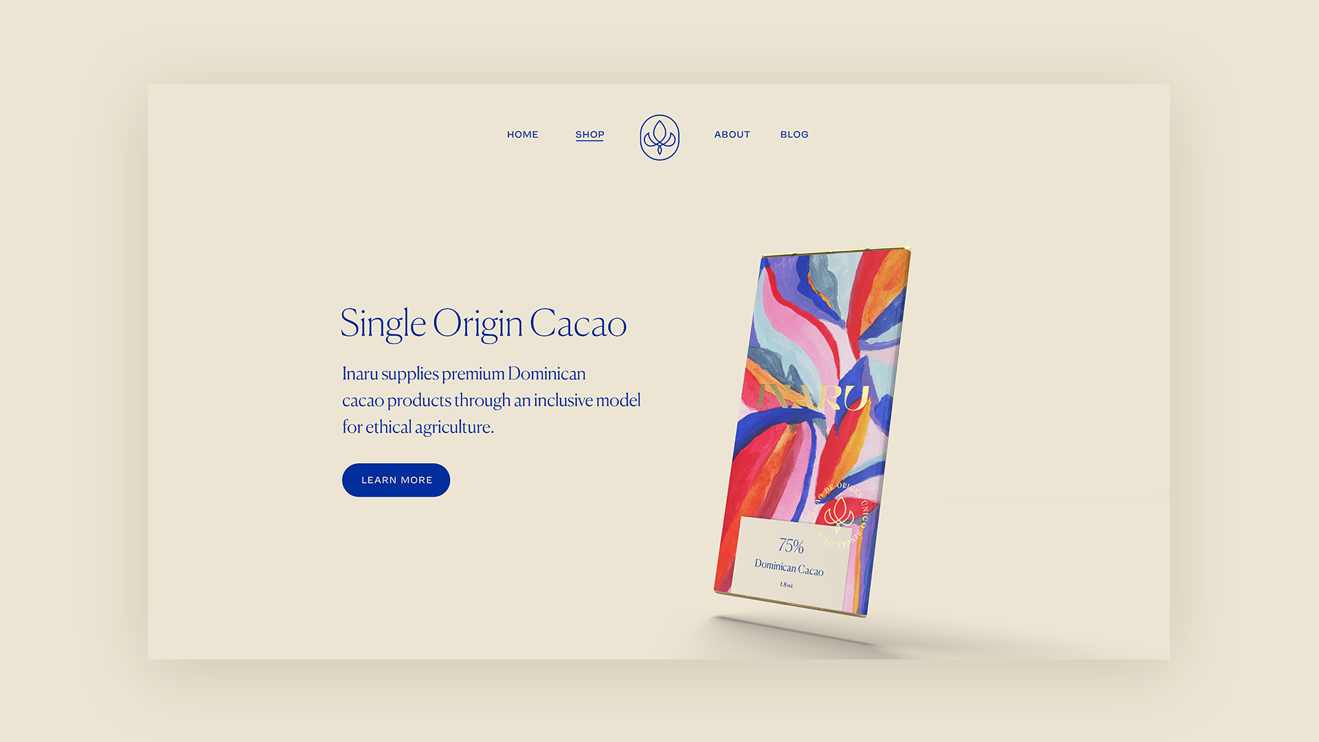
Website Design
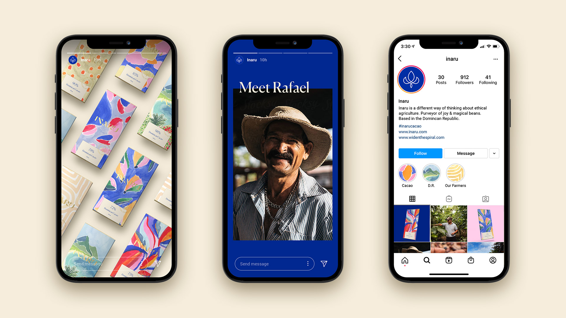
Inaru is a movement in modern ethical agriculture, founded in the Dominican Republic, that connects consumers with premium cacao products that stand for accessible luxury.
In partnership with the amazing team at West, I was tasked to bring this identity to life. Based on their strategy, the core idea was to create an identity that reflects nature's vibrancy and graceful elegance.
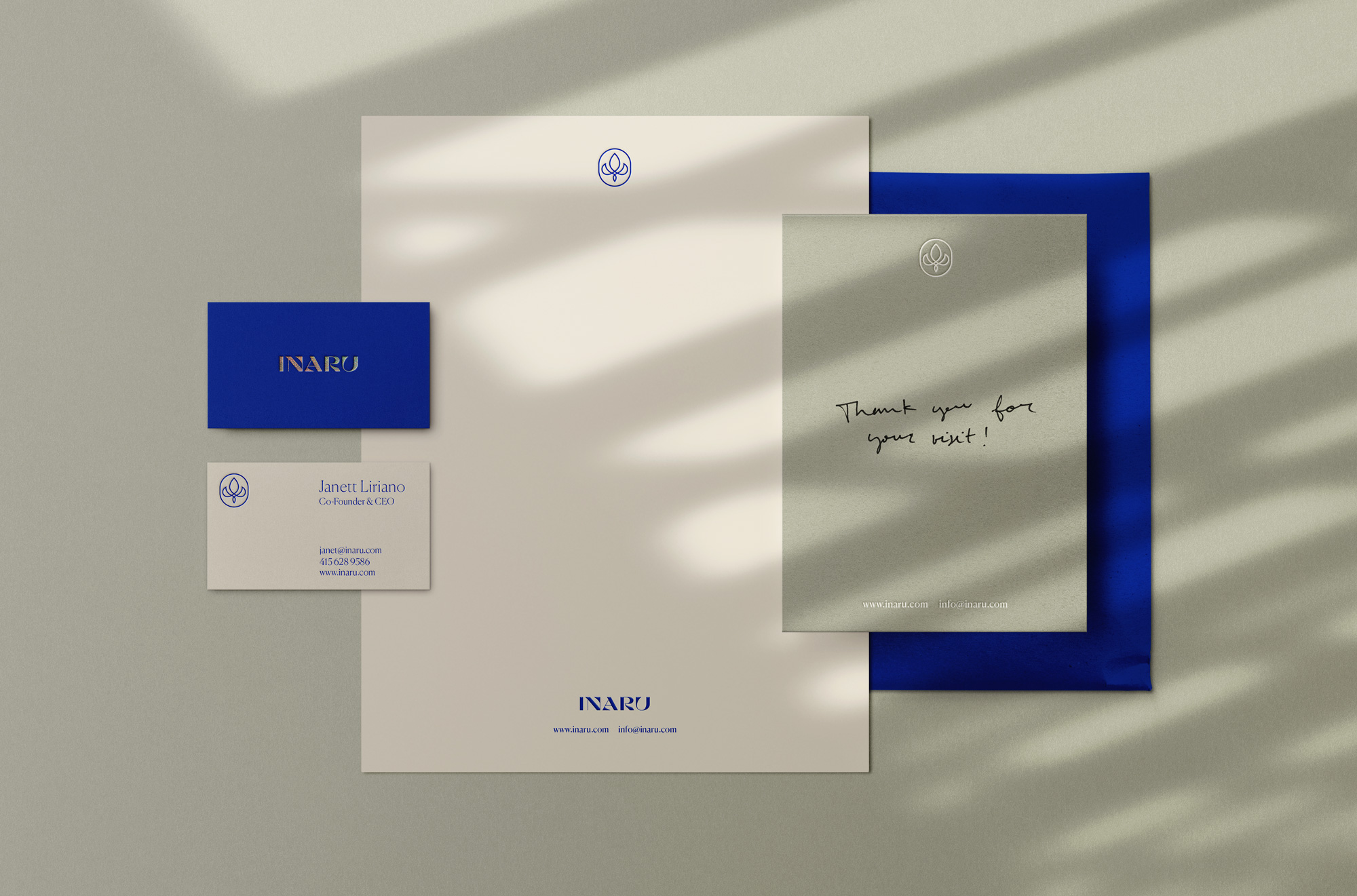
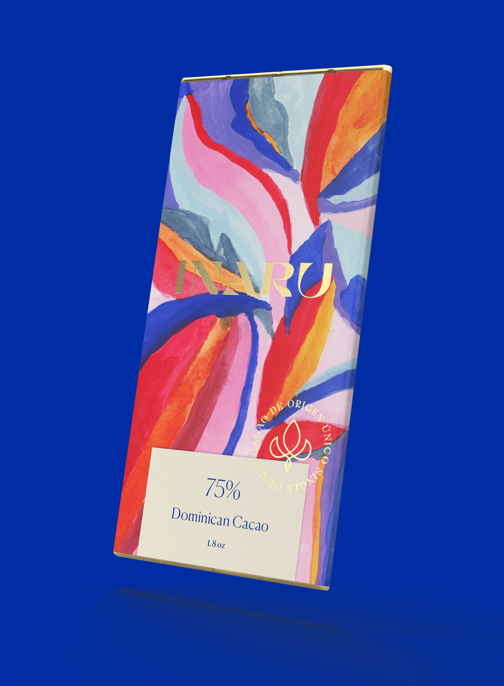
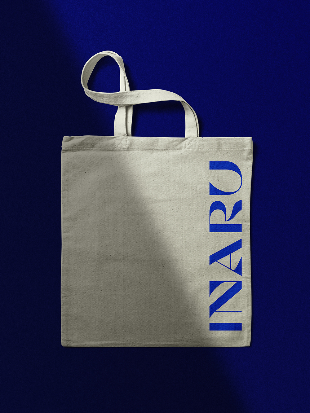
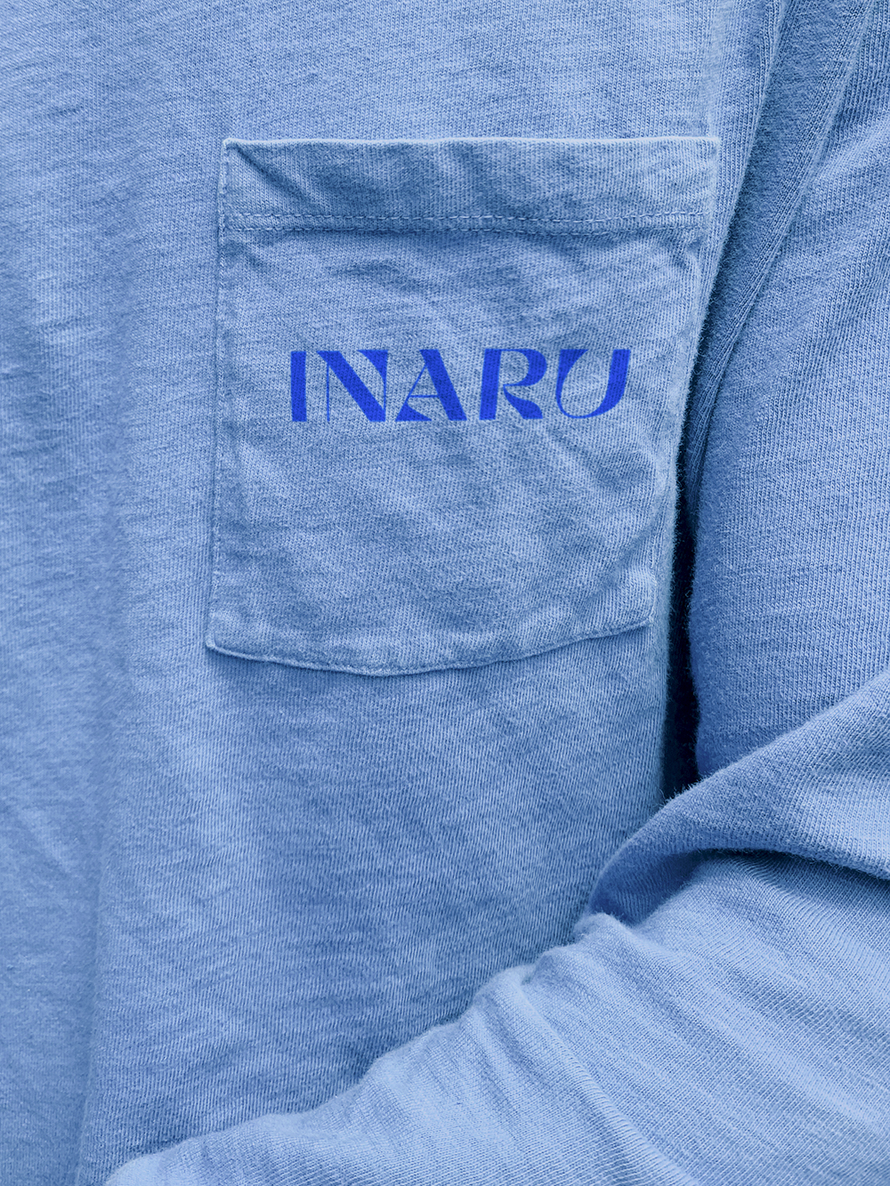
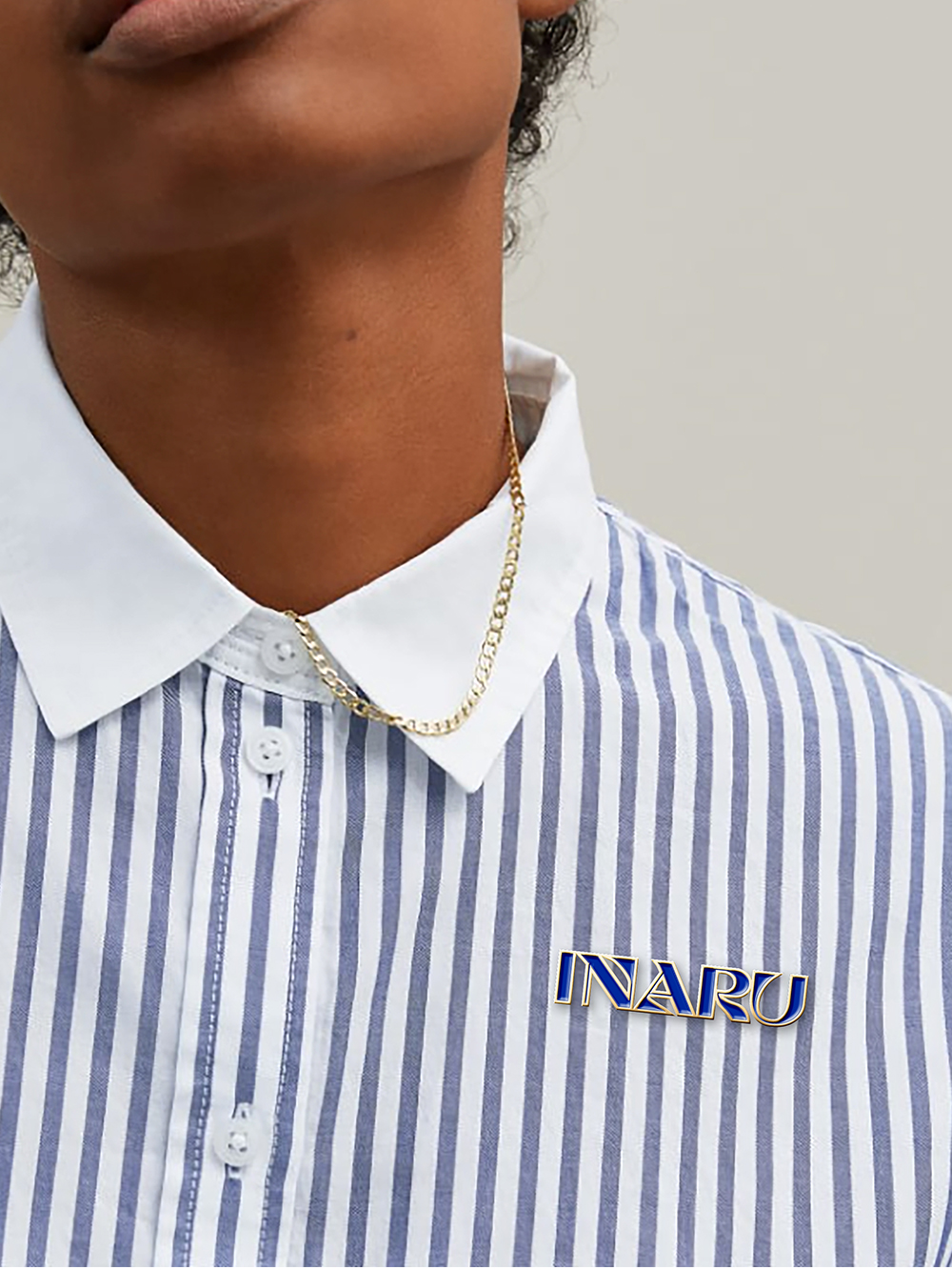
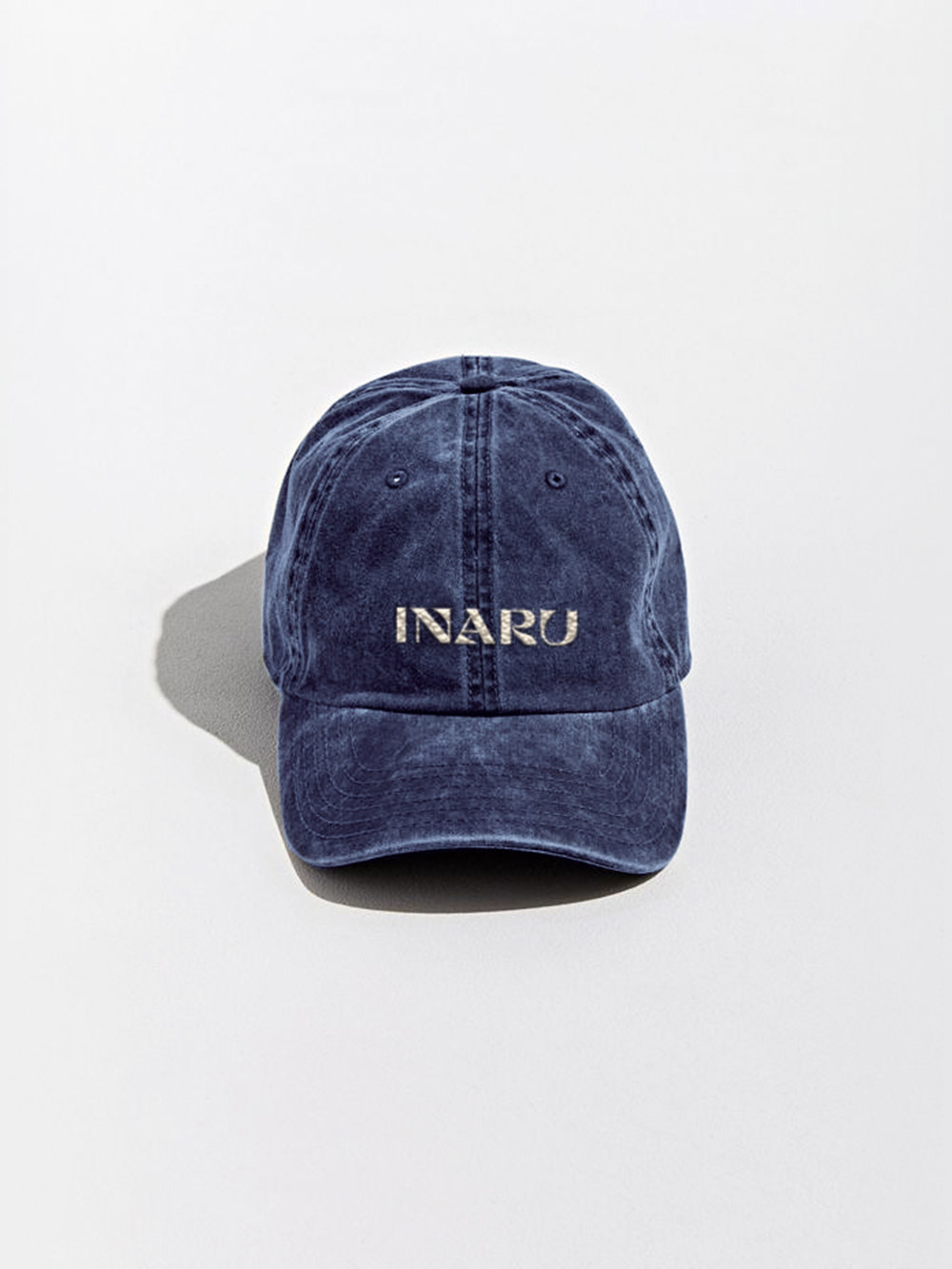
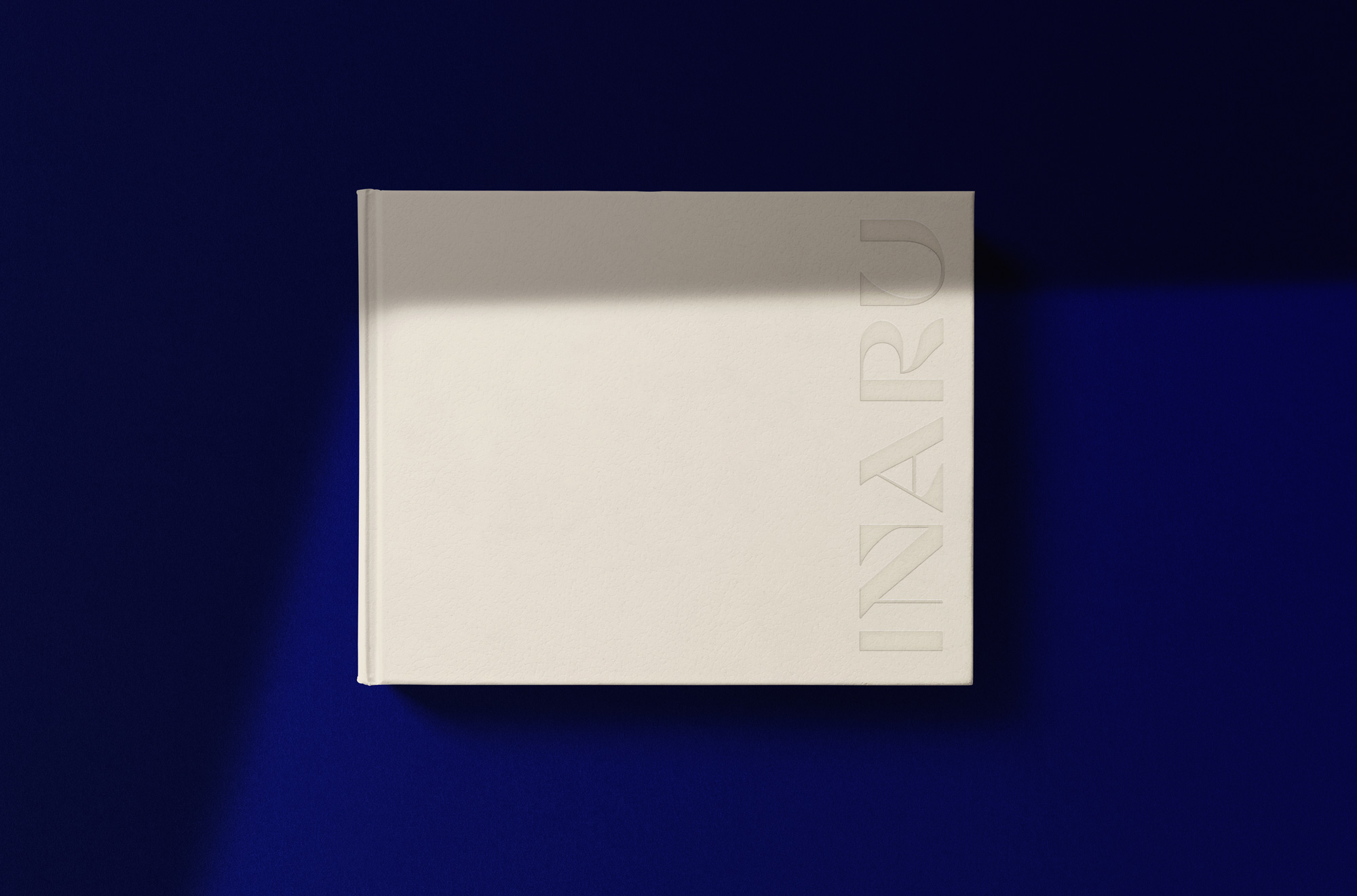
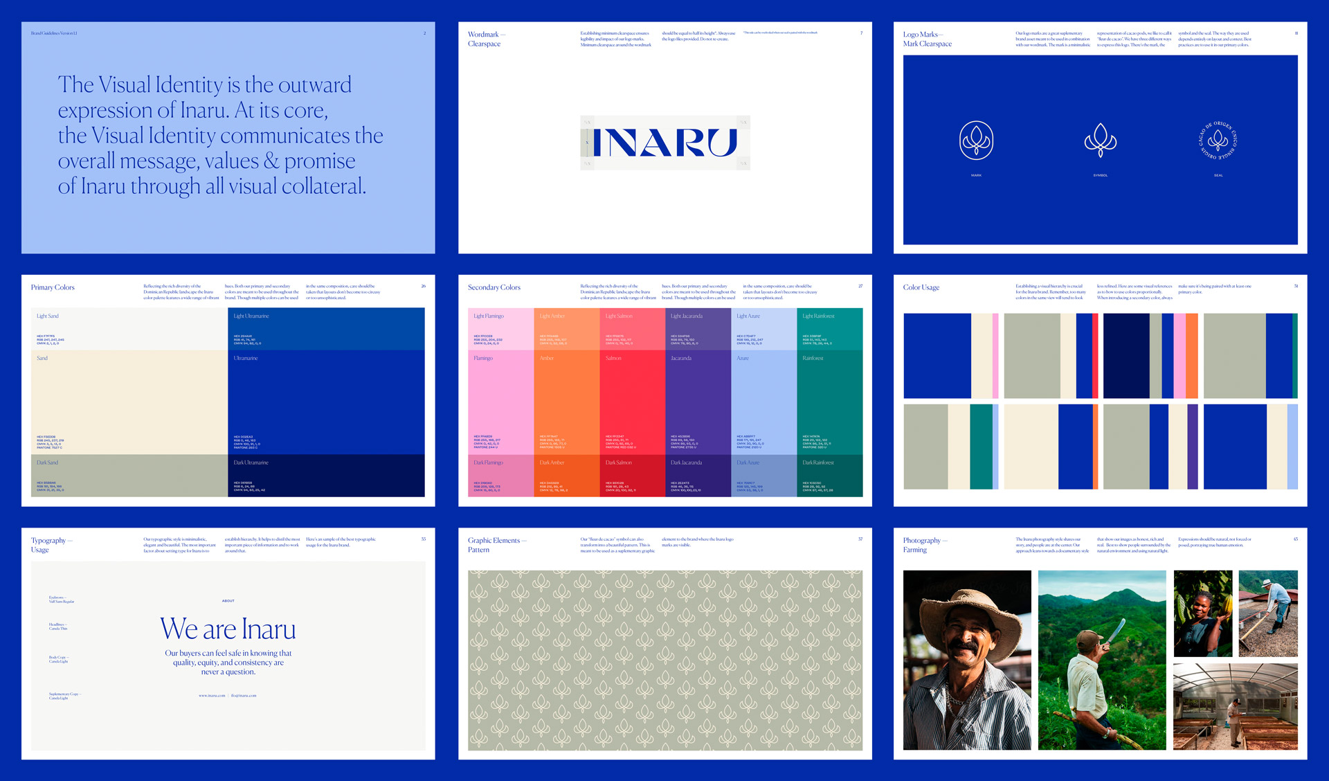
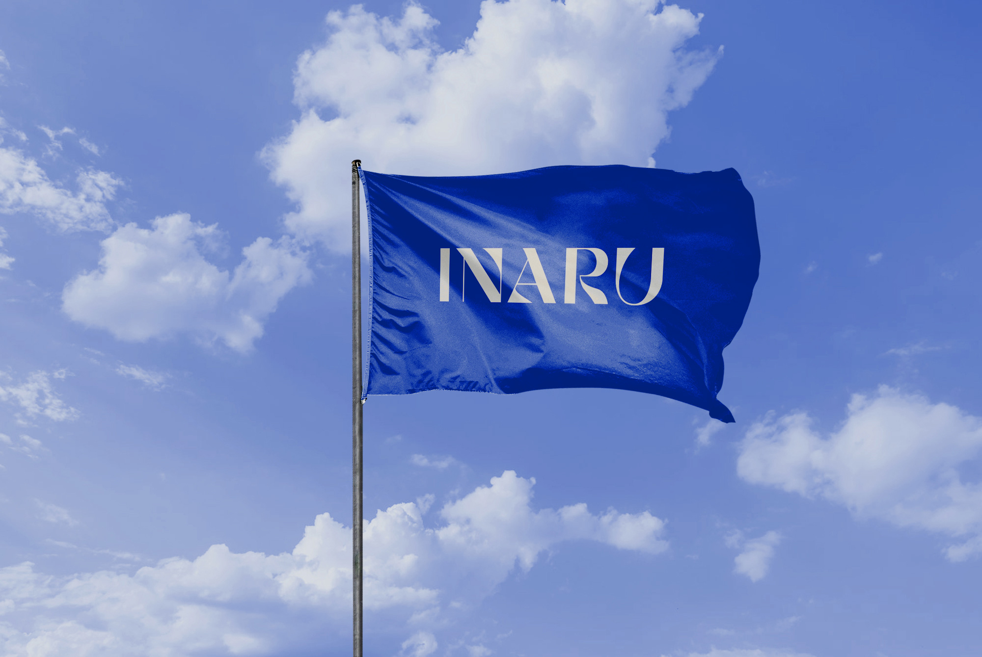
One of the brand goals for the clients is to transform the status of the Dominican Republic as a top cacao-producing nation. We strived to create a timeless identity. Starting with the wordmark, set in Cosi Azure by Nikolas Type, has the perfect balance between slim/delicate with chunky fluid forms.

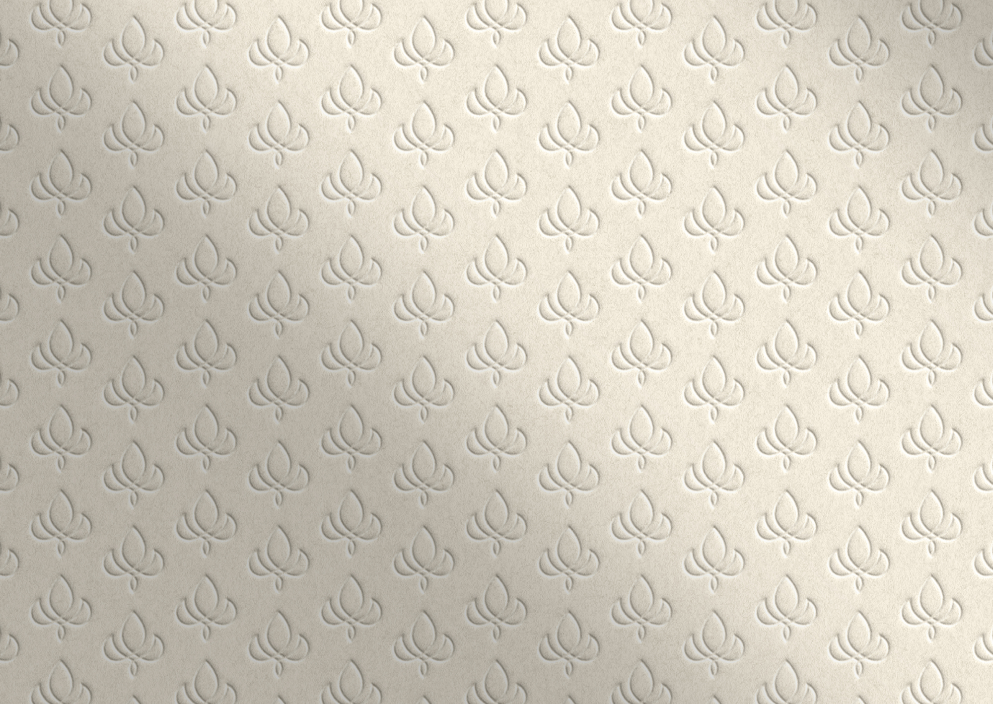
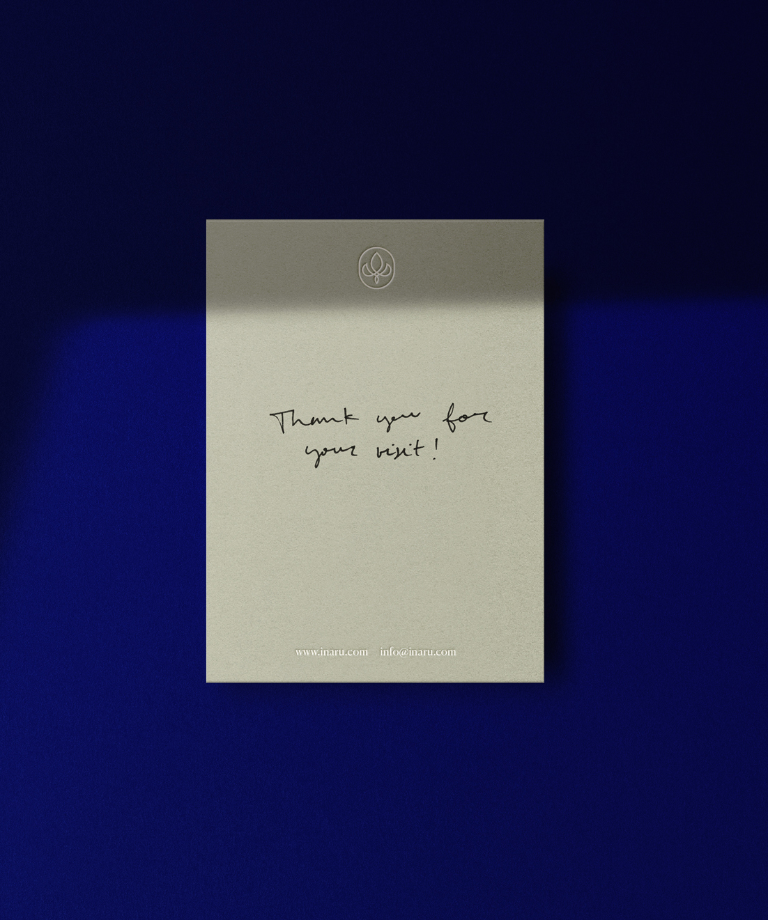
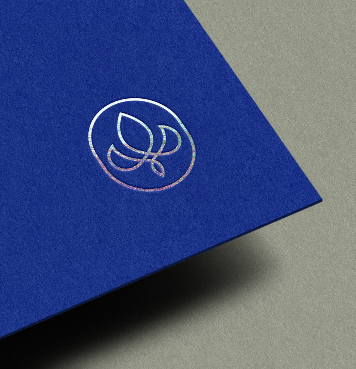
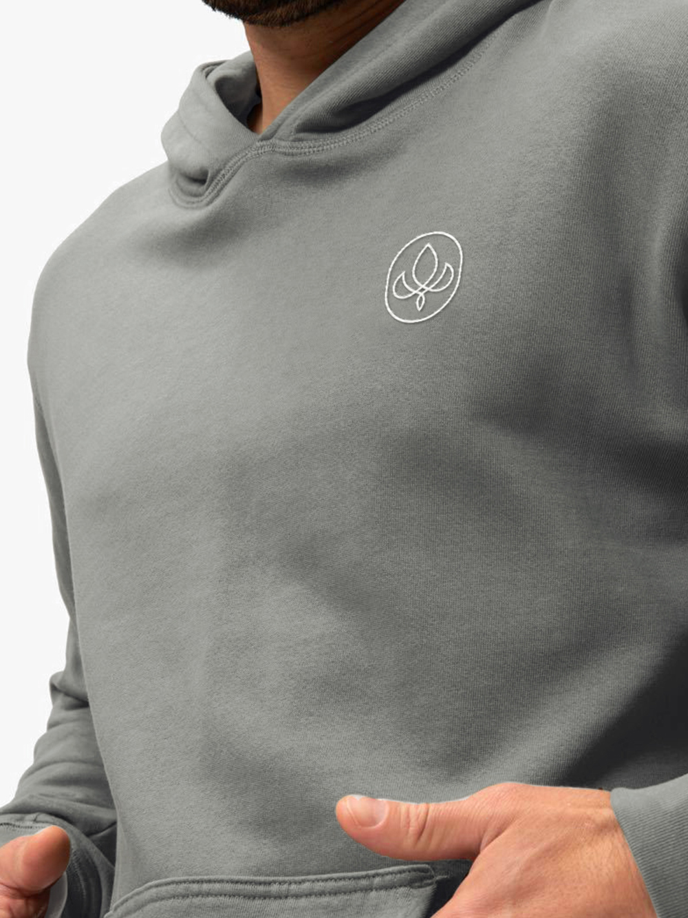
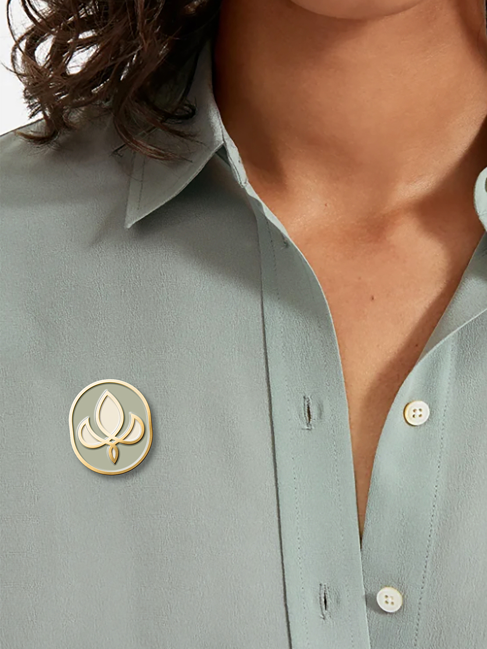
The symbol was created from sketches based on a cacao pod with leaves.
The shape, which reminds many of a fleur de lys, adopts instant familiarity, giving it the impression of an old-world family crest. This idea heavily reasonated with the clients which are a family business aiming to create a name in the cacao industry.
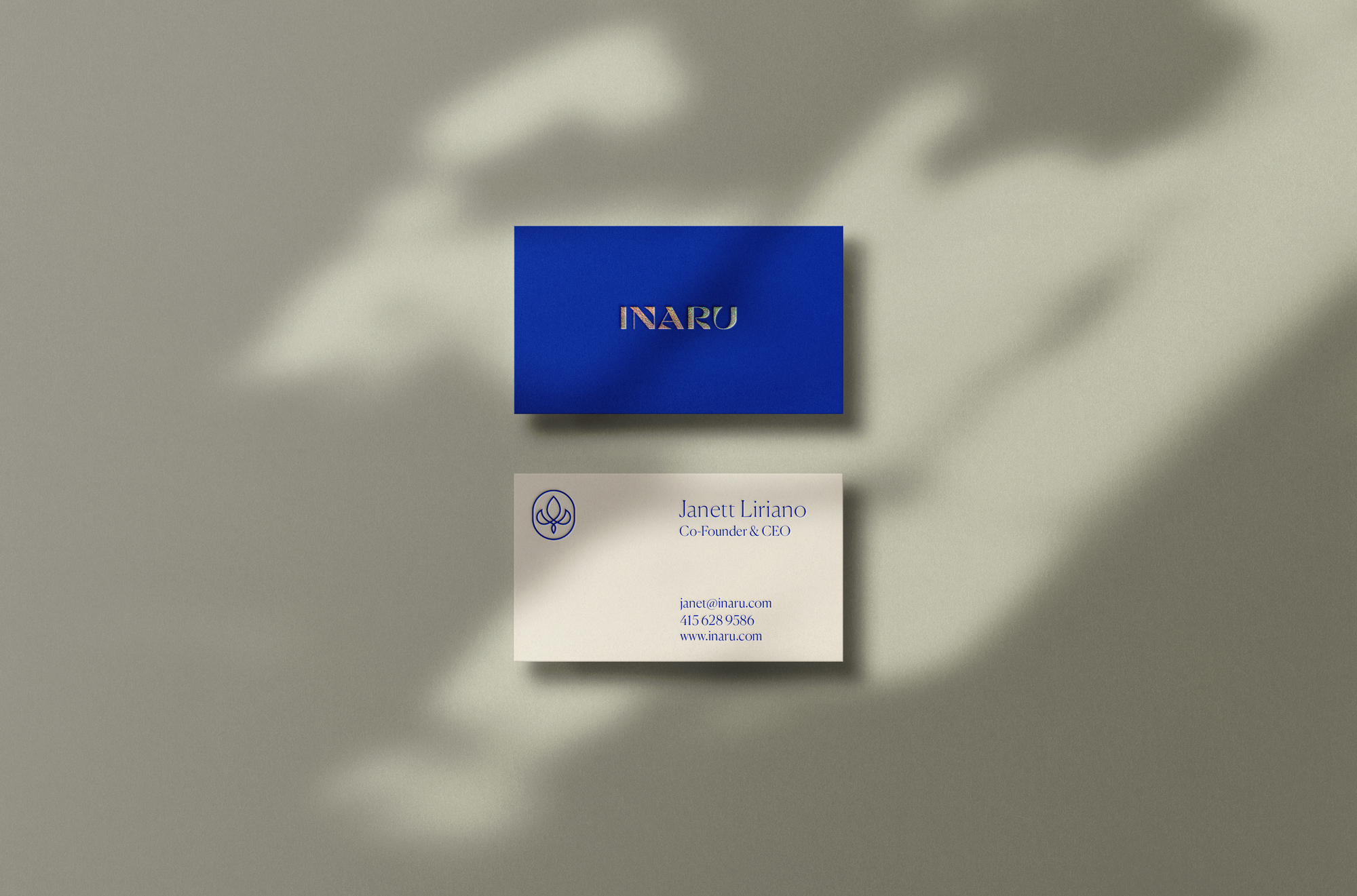
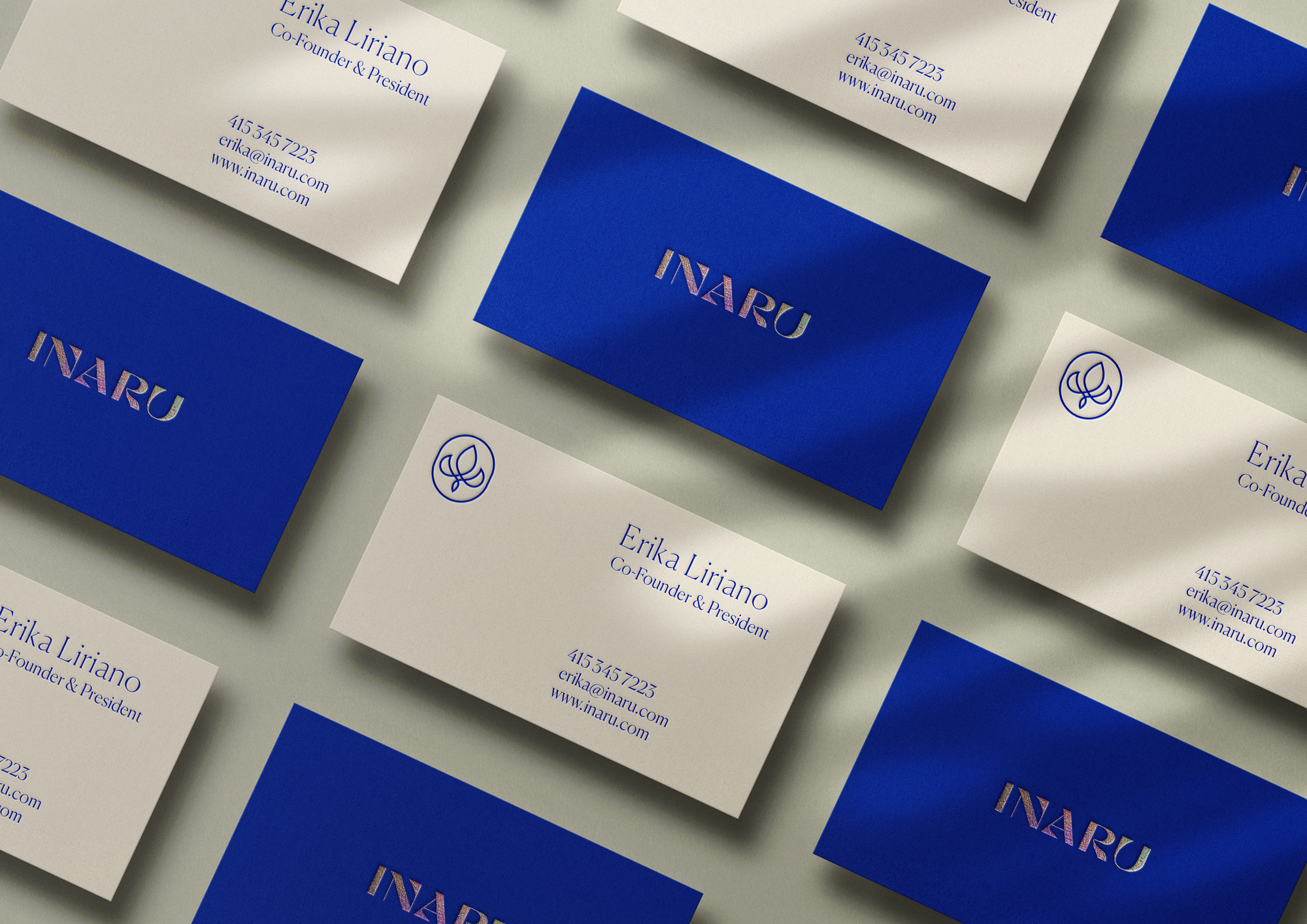
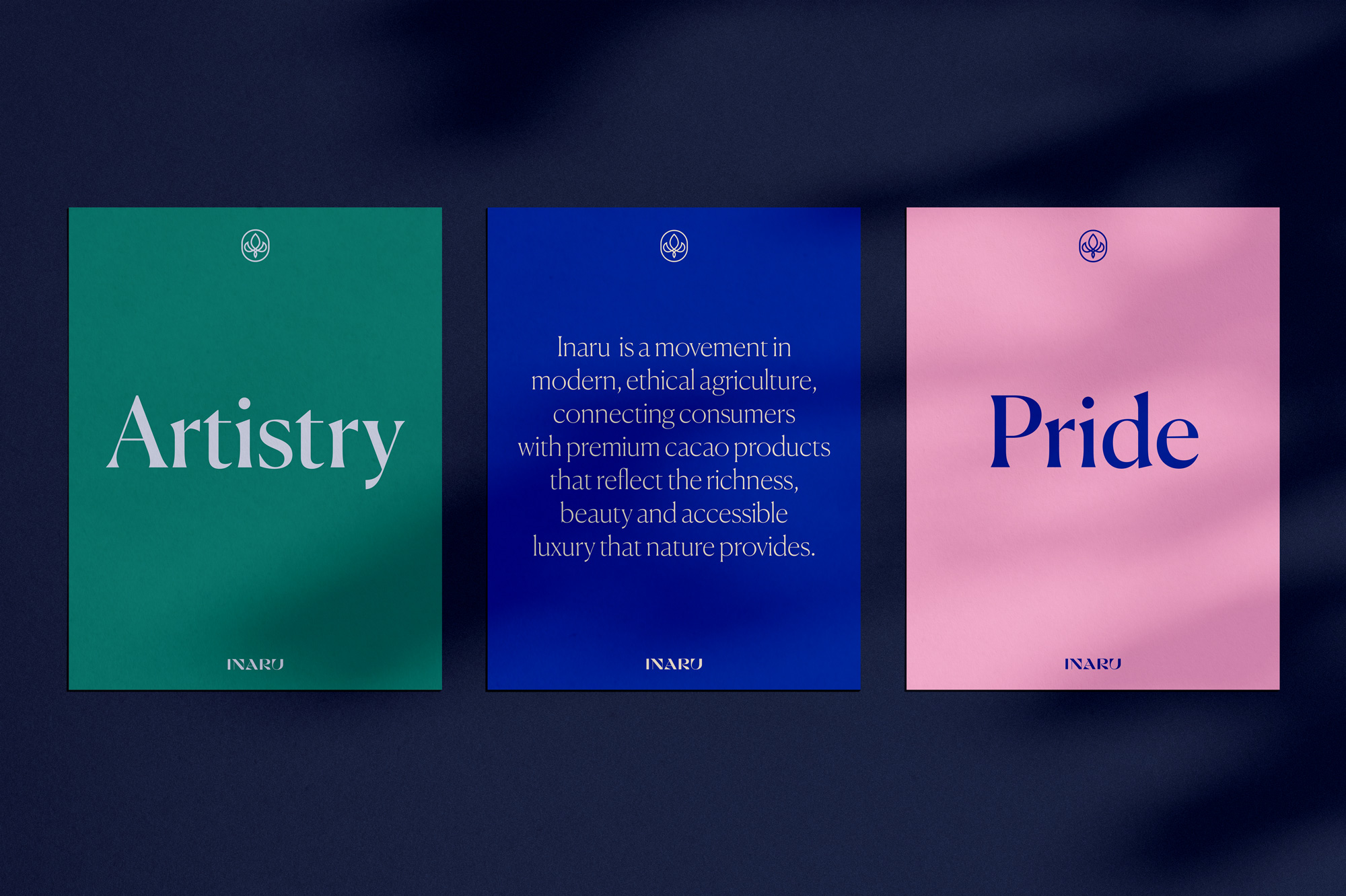
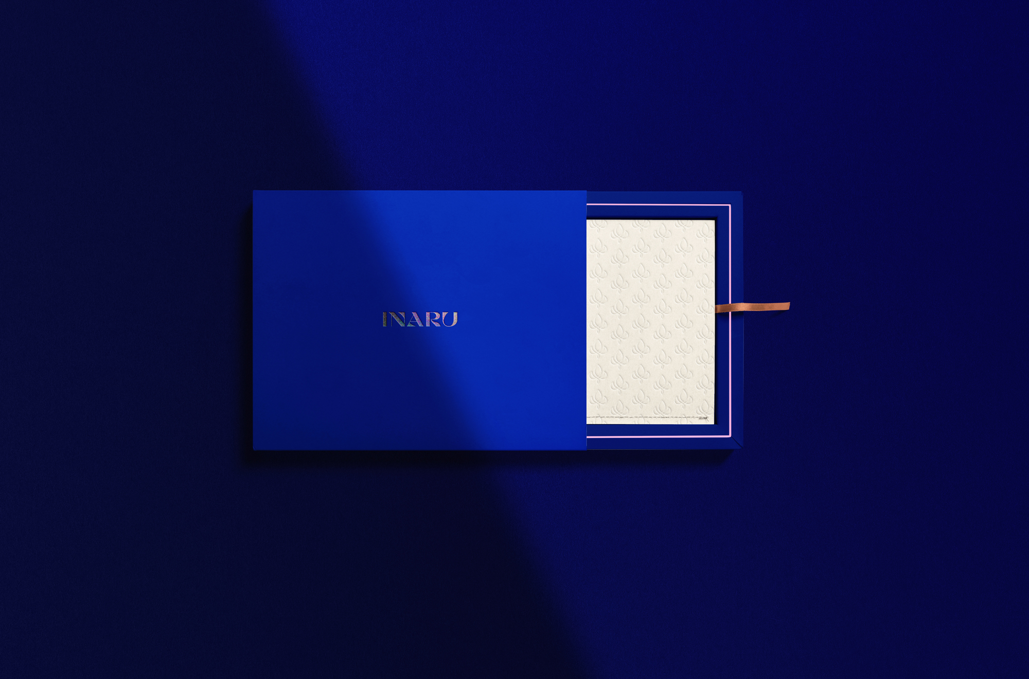
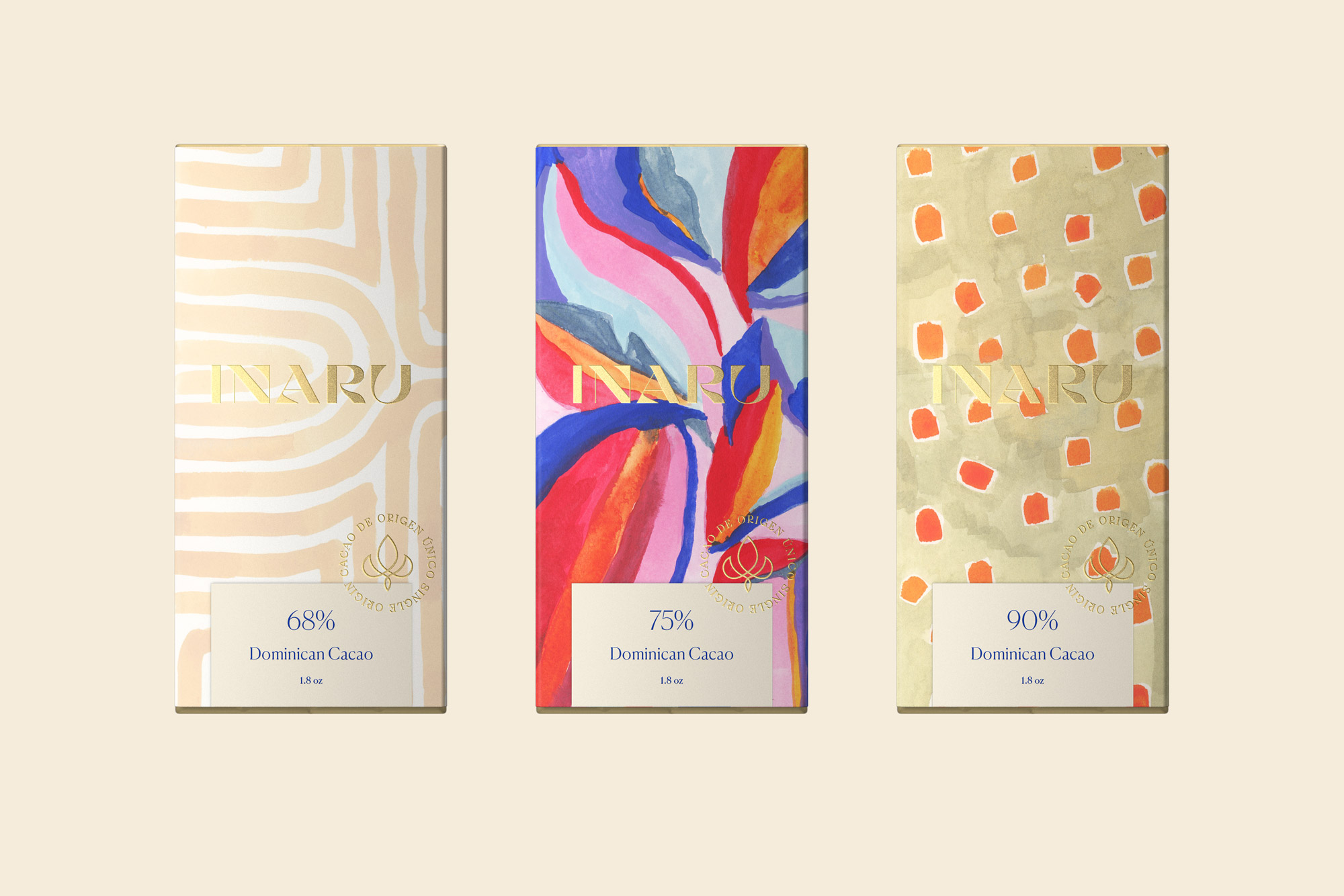
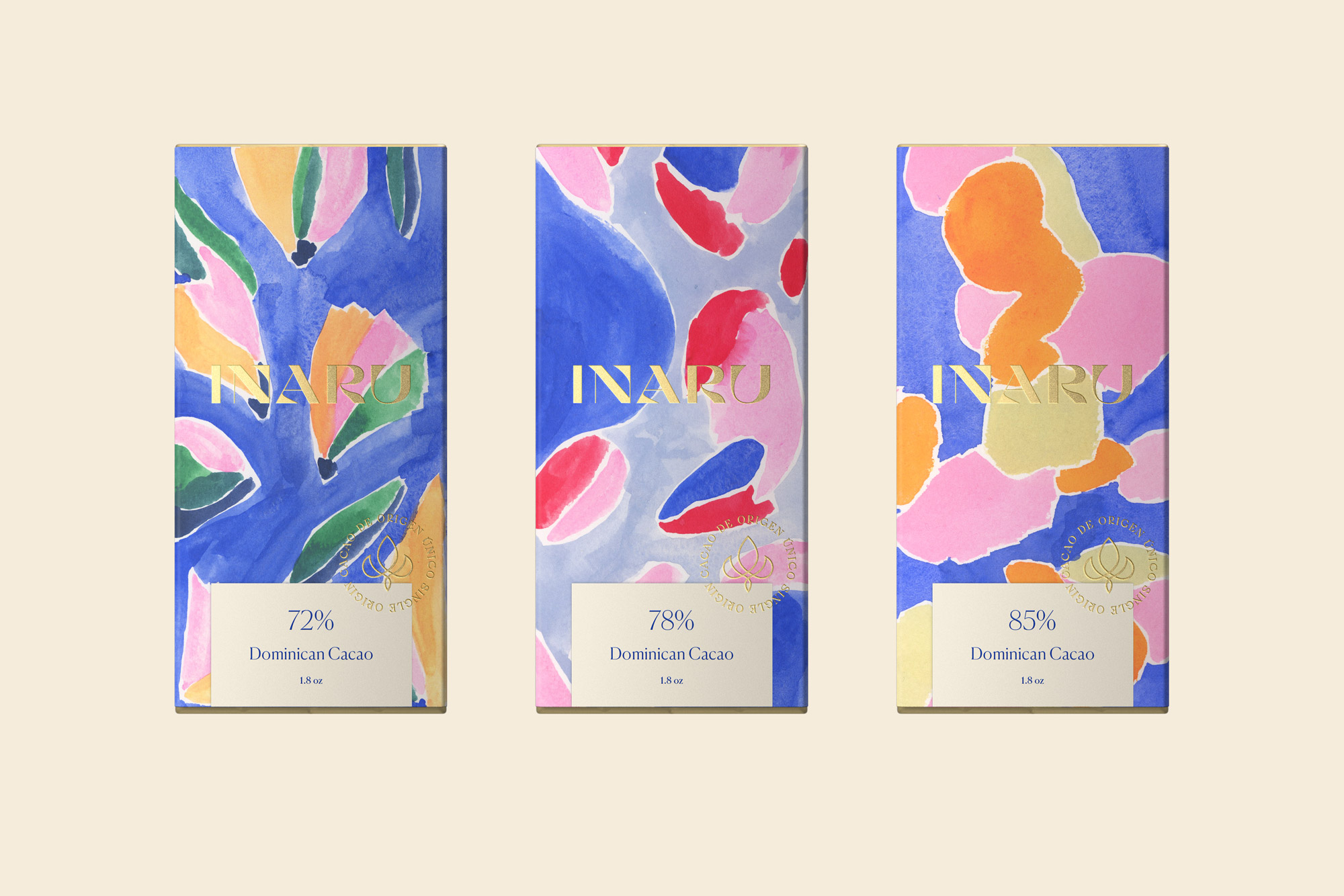
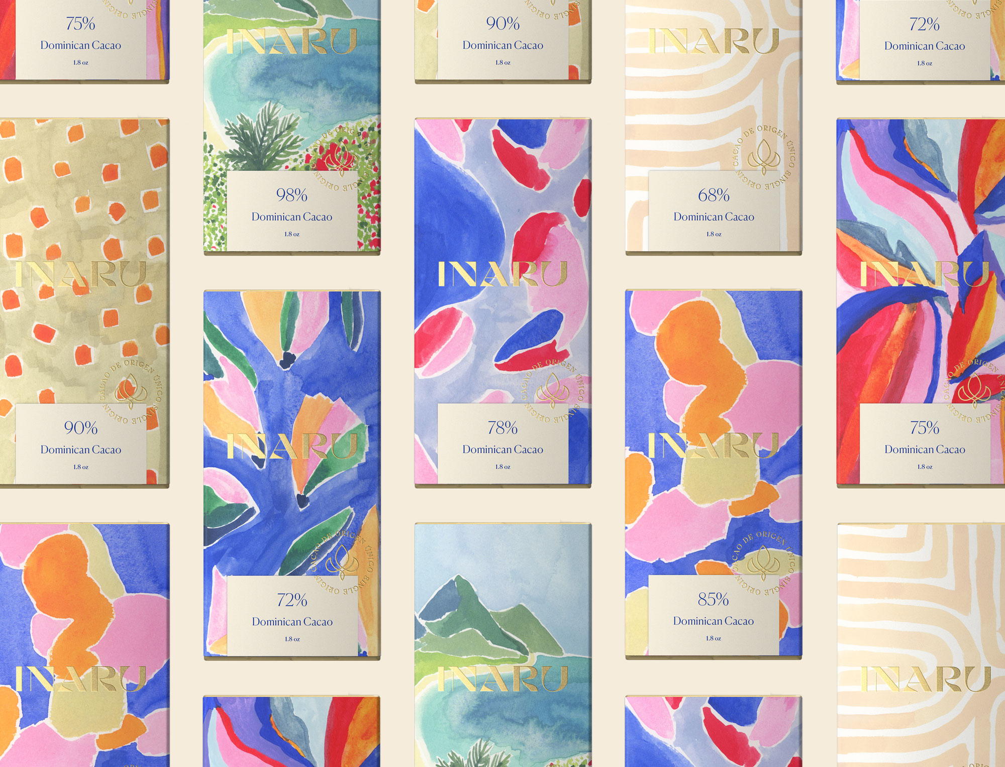
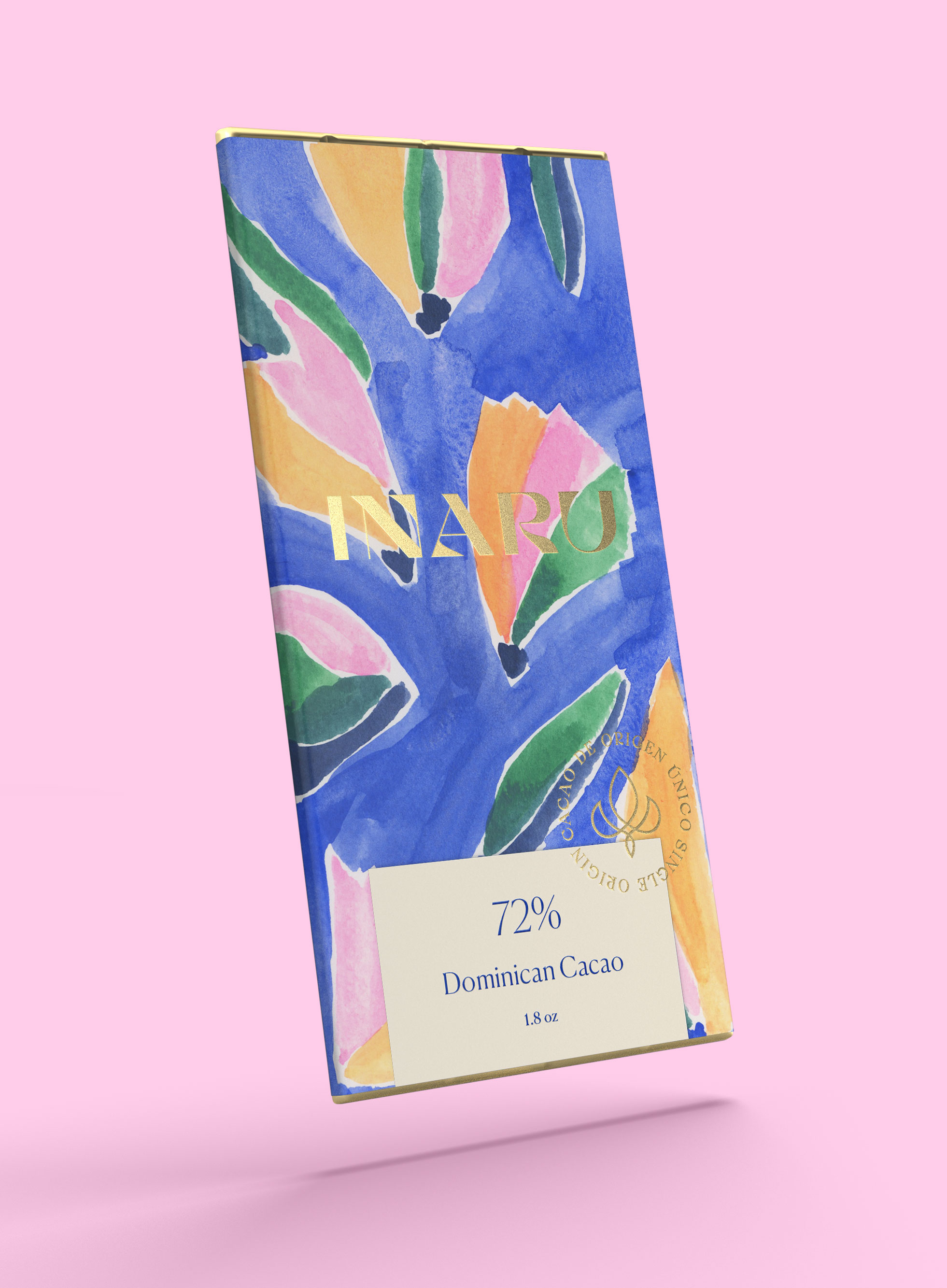
While we decided to keep the corporate image intentionally restrictive on color usage and illustrations. We knew we wanted the packaging to truly stand out from a saturated market of chocolate bar packaging.
This set of colorful illustrations set the tone for the continiously growing brand. Inspired by natural, organic shapes, Dominican landscapes and abstract shapes & forms.

Credits —
Creative Direction: Felicia Reyes
Strategy: Jess Wen
Design & Art Direction: Alexandra Camacho
© 2021 Alexandra Camacho